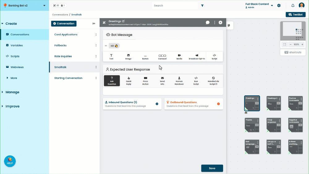
A carousel creates a horizontal series of cards, with each card consisting of an image, a title, a subtitle and up to three buttons.
For best results, make sure your images fit the recommended dimensions.
Carousel buttons can perform actions when a user presses them, such as storing data, scheduling event notifications and running scripts.
- Click the Carousel message type to add a carousel to the passage, then add and configure your cards.
- Drag the handles on the left to re-order the passage content.
- Click the expand icon next to the carousel to switch between compact and large cards.
- Click the delete icon next to the carousel bubble to delete it.
- Click the image icon to toggle carousel images on and off.
Images are toggled on or off for all cards in the carousel.
Some channels may not send a carousel message if it does not contain images. You will see a warning if you toggle the images off when creating channel-specific content for a channel that does not support it, or if you toggle images off in the default channel. If you know that all the channels your chatbot uses support sending carousels without images, you can safely ignore this warning.
All message types have a default maximum length. If you use a placeholder chip and the value of the placeholder makes the total length of the message longer than the limit, the message is truncated to the limit. The default length for carousel titles and subtitles is 80 characters. The following channels use different limits:
- Google Business Messages (including via Khoros): 200 characters for carousel titles and 2000 characters for subtitles
- Smooch v2: 128 characters for carousel titles and subtitles.
- Zendesk: 100 characters for carousel titles and 150 characters for subtitles
- Khoros subchannels other than Google Business Manager, Meta Messenger, and Brand Messenger: 128 characters for carousel titles and subtitles.
Add and configure carousel cards
To add a card to the carousel, click the plus icon on the right. To edit a carousel card:
- Click Create in the left navigation, then click Conversations.
- Click the conversation with the passage you want to edit.
- Click the passage you want to edit.
- Click the Title or Subtitle to edit the text directly.
Type @ to add the placeholder chip for a variable, constant, or entity.
If the card starts a new passage, the card title will be used as the name of the new passage. - Click the placeholder image to edit the image. You can:
- Paste a publicly available URL in the Image URL field.
- Drag and drop the image you want to send into the Media Library.
- Select an image that has already been uploaded to the Media Library.
- Click + Button to add a button to the card.
To reorder the cards within the carousel, click and drag the handles on the top of the cards.
To delete a card from the carousel, click the image of the card and click Delete.
Recommended dimensions
For best results:
- For large image carousels, a square image with a 1:1 ratio, 780px x 780px is recommended.
- For card-style carousels, a landscape image with a 1:1.91 ratio, 780px x 410px is recommended.
Images can be PNG or JPG files. To ensure your image loads quickly for your users, keep the file size under 500kb. A file size of 100-150kb is recommended.